Connect
Creating meaningful memories with friends has never been this easy…
purpose
Final project for “Intro to UI/UX design” course
timeframe
June 2020 /2 weeks/
team
Sophie Wang /designer/
Myself /designer/
Role
researching, ideating, sketching, wireframing, prototyping, user testing
Connect: Overview
For our final project, we wanted to address the difficulty of maintaining friendships and creating new, meaningful memories with friends during the pandemic. We found that people are feeling dissatisfied and distant from their friends as online interactions, especially those over social media, often feel shallow and ingenuine. We hope that Connect will help people organize more fun times with friends, strengthen their existing connections, and overcome feelings of isolation.
Phase 1: UX research
USER INTERVIEWS
To uncover the challenge, we started by interviewing those who fell under our main target group of college students. Some recurring pain points included:
lack of shared experience
“I miss having a common language of knowing where everyone is going to study. I can’t just find my friends in the library late at night and eat hot Cheetos with them while we talk about how horrible the Econ midterm was that day.”
- Alex ‘21
inauthentic relationships
“Online interactions feel fake. I see people commenting on each other’s posts with comments like ‘can’t wait to hang out with you after quarantine!’ yet I know these people barely even talk in real life.”
- Stephanie ‘22
inconvenient planning & scheduling
“Social distancing really made it hard to plan stuff with friends. Oftentimes, no one in the group takes the responsibility of planning the get-together, leading it once again to never occur.”
- Sophie ‘22
USER PERSONA
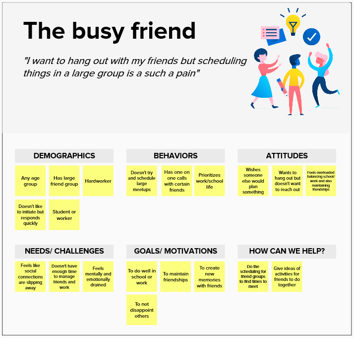
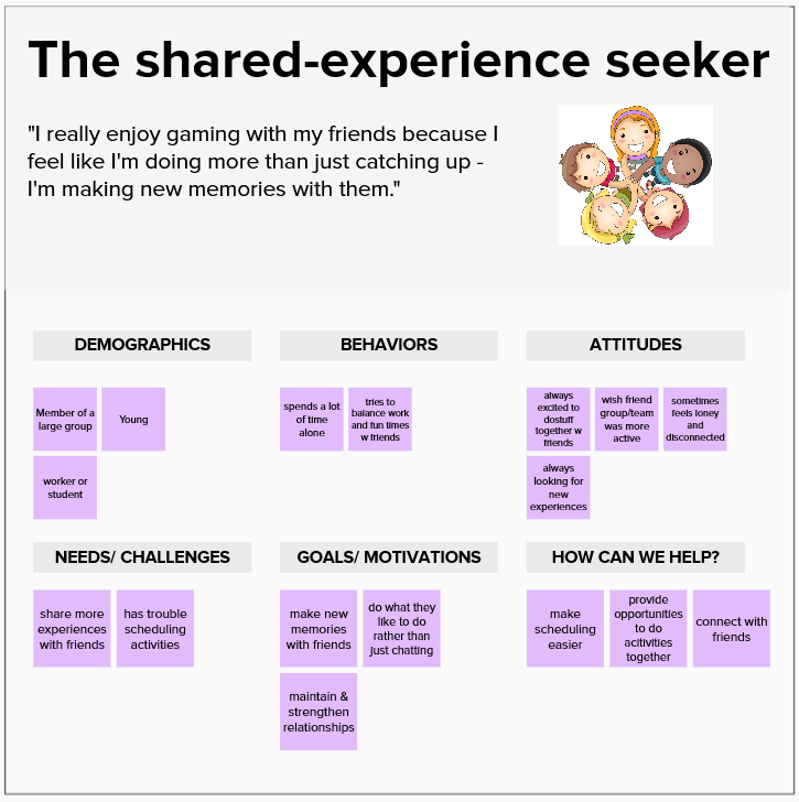
Based on these pain points, we created two user personas that represent slightly different demographics within our target user group. The personas helped our decision-making throughout the process.
DEFINING THE PROBLEM
The user interviews helped us to inspect the various challenges of creating meaningful memories with friends. Based on the most common pain point, we decided to focus on:
“How might we make it easier for users to create shared experiences with others?”
After settling on our HMW, we chose our key design principles:
Convenience: Our solution must make it easier for people to create new memories together.
Minimal features: Our solution should help users create shared experiences, and do little to nothing else. Feature overload could dissuade users from using our solution at all.
Delight: Every interaction on the app should be exciting and enjoyable.
Ideation
After settling on our HMW and defining our principles, we both completed 3–4 rounds of sketches featuring the core functions that addressed the users’ pain points. We played with different layouts, hierarchies, user flows, and navigation tools to create the most seamless and enjoyable experience for the users. The process helped us to make some key design decisions.
Decision #1: We got rid of a navigation menu to minimize user interaction and make the user flow as simple as possible. It also helps to avoid feature overload and encourages users to solely focus on spending more time with their friends.
Decision #2: Since we focused on creating a delightful experience for the users, we made design choices that looked playful and fun rather than formal. For example, we mostly used cards and bright colors that are easy to navigate and exciting to look at.
Decision #3: Our last big decision was to stick with a flat UI design. We wanted to take advantage of its focus on functionality and create a more intuitive user experience. We paid extra attention to showing the “clickable-ness” of already-flat elements.
After each iteration of the initial sketch, we noticed the similarity between our key screens and consolidated our separate sketches into one before moving on to grayscales.
Here is my second round of iteration showing the main screens:
Building the prototype
After multiple rounds of sketches and hours of discussions, we finally came up with “Connect.” It is a mobile app that helps users to maintain and strengthen their existing friendships by having more authentic interactions both digitally and in person. Keeping our goals and principles in mind, we tried to create the most convenient and enjoyable way of creating new memories with friends.
Let’s take a closer look into the prototype!
Finding a time that works for everyone has never been easier!
“Connect” finds and suggests possible times for friends to hang out based on their calendar inputs. The users’ profiles will be connected to their calendar, and the app will show timeslots that more than 40% of the group is available. The timeslots will also show the full list of those who can meet and what they’re interested in, helping the event creator to find themes and activities that suit everyone’s taste.
The smart algorithm for syncing multiple calendars at once will save time and make scheduling as hassle-free as possible.

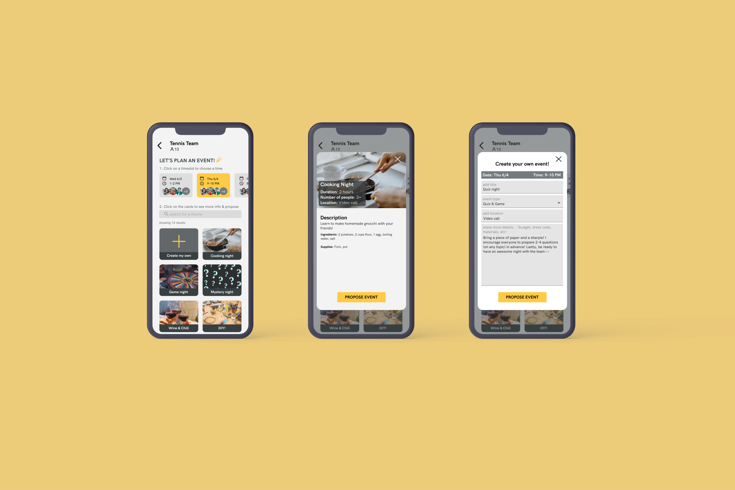
2. Planning activity is only one tap away!
During our user research, we found that video calls and social media interactions, like commenting on others’ posts, often don’t feel authentic. Thus, “Connect” offers ideas for group activities that are more than just chit-chatting. Each event idea is shown as a theme, and the event creator can browse through different themes once they choose a timeslot. The theme card also includes a more detailed description of the activities featured on that theme. Event planning will be completed by a single tap on the “propose event” button and sent to the group channel. Also, users can create their events without being limited by the themes. All in all, the event planning flow saves time and stress for the event creator while offering ideas for fun and adventurous group activities.

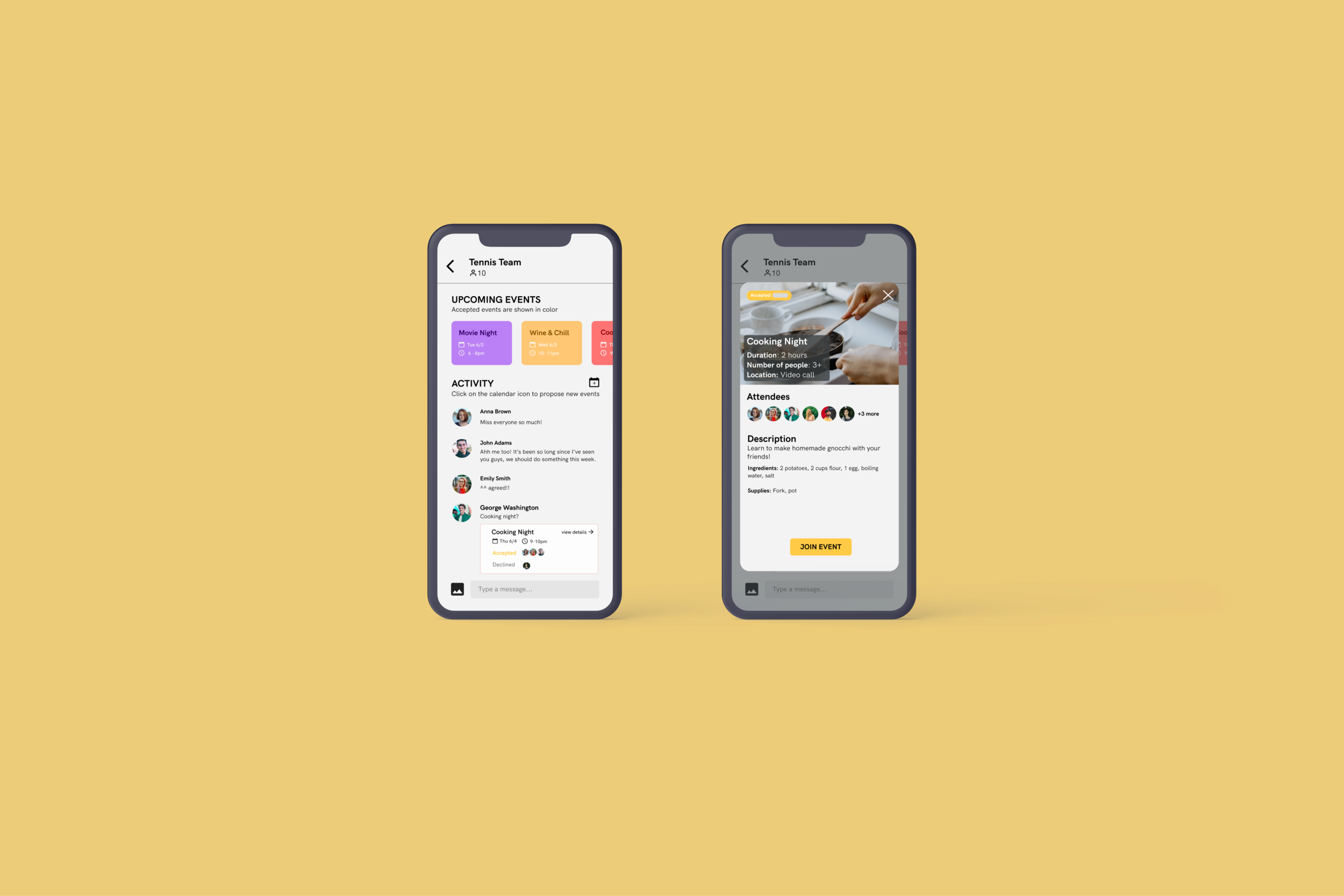
3. You will find everything you need on a single page!
We wanted to create an organized way to communicate with your friends and manage your events, as well. Each friend group will have a channel where they could schedule, propose, and track future events. The upper section of the screen shows the upcoming events for that week, and the ones that the user accepted to participate in will be shown in colorful cards. Our choice of bright colors is to “hype up” the users for their next thrilling experience. Below, users can chat with their friends and see the proposed events.

4. A video call function that ensures the most fun time with your friends!
Although Connect is not only built for the virtual world, we expect to see a high demand for digital hangouts even when the pandemic is over. Thus, we added a video-call function that includes features such as live chat and an activity guide. We initially wanted to avoid any additional features, but users have stressed the importance of a chat feature during video calls. If the event was created by choosing one of the themes on Connect, the activity guide will be automatically generated and sent to the video call under the name “instructions."

5. Last but not least, your homepage!
The main navigation will happen on the homepage that shows users’ upcoming scheduled events and their channels. Users can find the event description and a link/button to join the video call on the event cards. Underneath the upcoming events, users can see all their communications carried out in the channels. New channels can be easily created by tapping on the “add” icon on the upper right side of the channels.
Next steps
As “Connect” aims to help friend groups to create more shared experiences and strengthen their relationships, I want to make it as enjoyable as possible. That includes adding more themes based on the users’ preferences, extending to non-virtual settings, encouraging users to participate in more events, and the list goes on and on. I also want to conduct more extensive usability testing to improve the user flow and user interface.
My learning experience
Creating my first fully-prototyped mobile app helped me to gain many valuable skills and insights that amounted to much more than I hoped for when I started the project. From conducting user interviews to testing the app with potential users, every step helped me to build a thoughtful solution for a problem that everyone around the world is facing right now. Through this experience, I learned the importance of understanding the users and getting constant feedback from them. Also, as I worked on this project during the lockdown, the online experience helped me to improve at collaborating with a teammate over Zoom calls using various digital tools needed for a design project.
Check out the prototype:


