client
“Potentia Institute”
/partnered with two behavioral scientists from Stanford University/
timeframe
September - November 2020
(10 weeks)
team
PM - Naomi Miller
Designers - Emi Hayakawa, Christina Schoeller, and myself
Developers - Faustino Cortina, Garret Andreine
role
conducting user research, creating wireframes, building prototypes, user testing, illustrating
What is My Brain Explained?
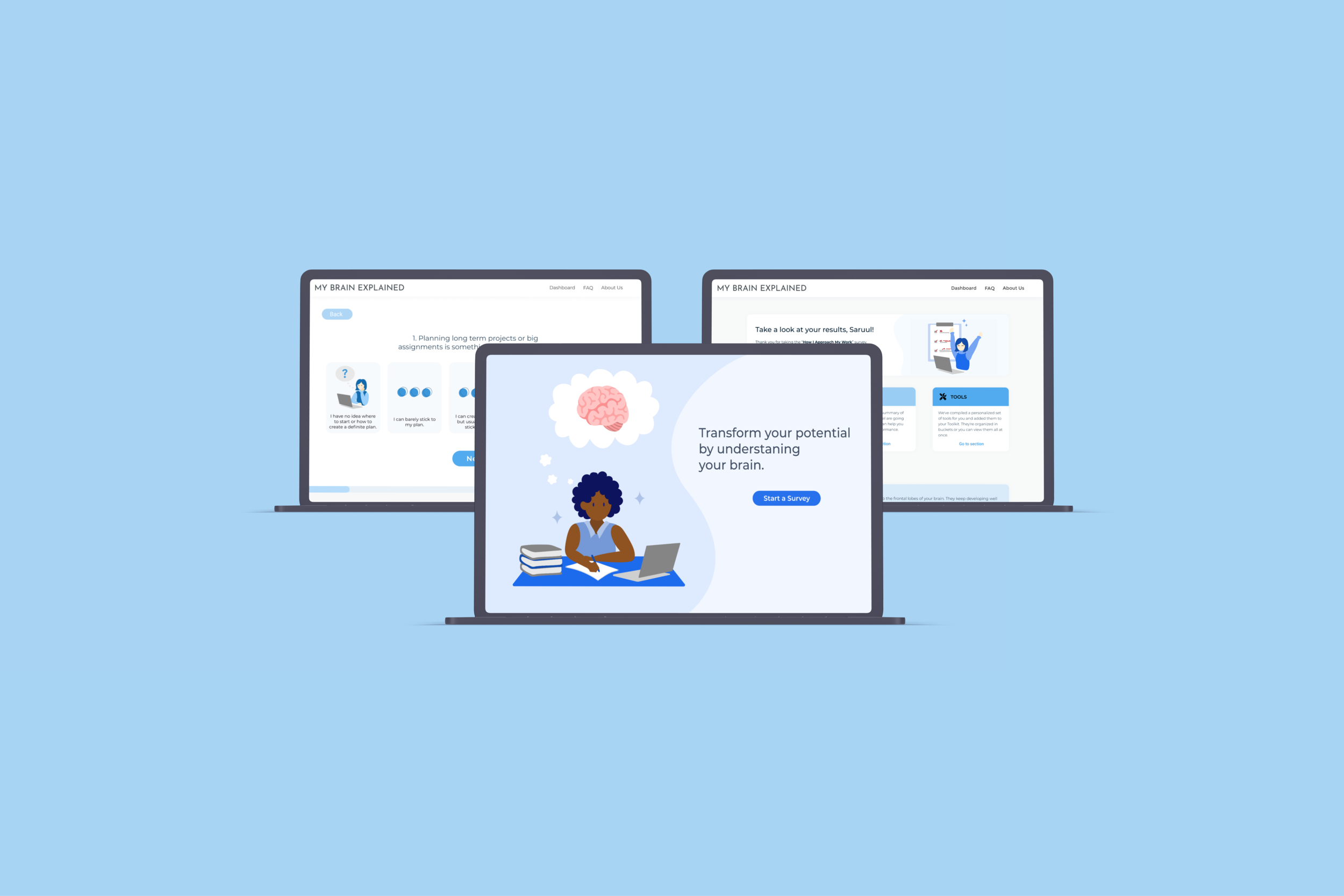
As a team of three, we designed a website for “My Brain Explained” - a platform that helps individuals to reach their cognitive potential through research-based surveys and customized resources. MBE was developed with research from the fields of neuroscience, psychology, learning sciences, and over thirty years of practical experience with children and adults who have struggled to reach their potential at school and work. As to how we planned our initial outcome with our partner, we successfully handed off the beta version of the website.
Our challenge
One of the main challenges that people who are seeking professional help to improve their cognitive potential is the ridiculously high cost of one-on-one sessions with a counselor. On top of the “high-end” nature of these sessions, counselors often don’t offer enough customized resources that have practical implications.
Thus, we sought to build a more accessible and customized platform that enables and incentivizes people to improve their cognitive performance.
First, let’s figure out the needs and goals of our users!
COMPETITIVE MARKET RESEARCH
We started off by doing market research on online platforms that offer a customized experience for their users based on their test results. We found and analyzed similar platforms that successfully engage users through a playful yet informative user experience. We observed how websites like “16 personalities” and “Care of” give a feeling of personalization and care towards the user. We also liked how they use vibrant colors and round-shaped design elements.
“16 Personalities Test”
“Care of”
USER INTERVIEWS
Then, we interviewed college students who fell under our target group and asked them about their learning style, survey-taking habit, and problem-solving journey. We were eager to learn about people’s attitudes towards online surveys since MBE (My Brain Explained) offers customized resources based on the users’ survey results. We found that users want:
specificity in the survey answer options
knowledge of the length of the survey
a clear guide for tangible actions in their results
USER PERSONAS
We created two main user personas that represent the goals and struggles of our target audience of young adults. The first persona reflects the struggles of those who lack a support system and find it difficult to communicate their feelings and problems with others. The second persona represents those who are highly ambitious but in serious need of practical tips and advice.
Persona 1 - “Student struggling under the surface”
Persona 2 - “Inexperienced, ambitious intern”
JOURNEY MAP
We also created a journey map showing all the actions that people take when completing a survey. The mapping helped us to build empathy with our target users on a deeper level and also encouraged us to flesh out some ideas on improving the experience of taking a survey.
Design principles
Through our extensive user research, we learned that the surveys should be fun & easy to understand and users are eager for tangible actions on their survey results. Once we learned more about our target users and their pain points, we came up with our main design principles:
Fun & Visual
Our design should give a vibrant and cheerful feeling without losing professionalism. The visuals will also serve as a guide for those who might have trouble visualizing abstract ideas and concepts.
Accessible
The platform embraces inclusivity and accessibility. As the platform targets patients with learning disorders, such as ADHD and dyslexia, the designs must achieve ultimate simplicity and clarity.
Personal
As one of the main themes of the website is personalization, each screen should serve as a step towards building a personal connection with the user.
Now, let’s build a product that users can enjoy!
Keeping our design principles in mind, we brainstormed various features and mapped out the user flow based on the core functionalities (landing page, survey result screen, user dashboard). Here are some of my ideas that we decided to keep for our future design:
A simple step-by-step explanation of how the platform works
A sample survey question on the landing page to incentivize users
A “favorite” button to save the resources
BUILDING THE PROTOTYPE
Once the user flow for all of the main screens was mapped out, I focused on creating the customized survey output screen, onboarding screens, and account pages.
Survey output screen - personal, easy to understand, fun to look at!
The main components of the result screen include insights into user’s strengths & weaknesses and tailored resources for tangible actions that the users can take to improve their current cognitive performance.
After a few iterations, we decided to organize the resources into different categories, such as technology and strategy, after realizing the long list of resources might overwhelm the users and even discourage them from taking further actions. I also added a “Go to dashboard” button at the bottom of the screen as users weren’t sure about what to do next during the user testing.

Onboarding tutorial - exciting, engaging, and simple!
As the platform focuses on giving a personalized experience, we decided to add a little tutorial on how the platform creates that unique experience for each user. I wanted to create an informative and exciting onboarding experience for those who just joined the platform. I also considered the onboarding process as the first step in building trust with the users and making them feel safe about sharing their highly personal info on the platform.

Account page - the simplest one you could find!
The account page offers the users some flexibility and control over their account with four sub-pages: Edit profile, Notifications, Password, and Demographics. We decided to keep the sub-pages as simple as possible due to the time constraint of the development process.

Our UI decisions
COLOR SELECTION
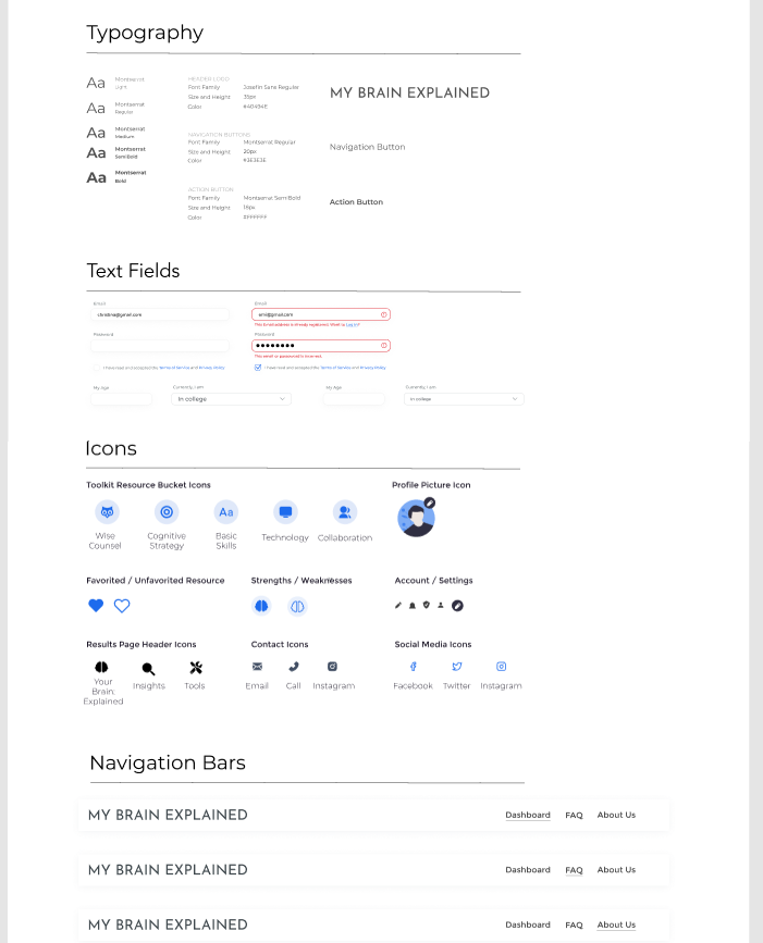
As our partners didn’t have a brand guideline, we created different versions of the user dashboard in almost any color you could imagine. Our partners really liked a blue color scheme as it looked both fun and professional, which directly aligns with our design principles. Also, a few users highlighted that the color blue reminds them of brain sciences and psychology during the user testing, reassuring our choice of blue as the primary color. We also focused on having a wide selection of secondary colors as the website uses lots of vector arts.
FONT SELECTION
We decided to use a sans-serif font as our partner shared that the latest research suggests that sans-serif fonts are the easiest to read, espefor those with reading-related learning difficulties. So, we landed on Montserrat since the font felt clean and professional but round enough to give a playful vibe.
User testing
Throughout the process of iterating on hi-fidelity grayscales, we conducted user testing on six potential users of slightly different demographics. Four of our user test interviewees were neuro-divergent and gave us unique insights as to how individuals with ADHD or dyslexia would navigate and experience our prototype. The feedback mainly pointed out the hard-to-read texts, high-density information, overwhelming amount of resources, and unclear survey answer options. Also, users suggested keeping the vector arts similar as they felt distracting. However, the interviewees’ comments were mostly positive throughout the sessions.
Final design
The final design offers a seamless and intuitive user experience that builds up into giving customized guidance for users in reaching their cognitive potential. Vector arts were used generously to help the users visualize and to make the website look more playful.
You can check out the website* here: https://my-brain-explained.netlify.app/
*the web design has been updated by other designers in the next terms


