PrizeRing
Come together and enjoy the shared experience of live entertainment!
client
Dartmouth Grad Student
/in partnership with the DALI Lab at Dartmouth College/
timeframe
January - March 2021
/10 weeks/
team
PM - Sonal Butala
Designers - Lauren Segal and myself
Developers - Tyler Vergho, Jordan Sanz, and Barkin Cavdaroglu
role
conducting user research, creating low-fi & hi-fi grayscales, building prototypes, user testing, creating a style guide
What is PrizeRing?
PrizeRing is a live game show app where users can repurpose social media content to win real money. Users create and participate in live game shows, creating a fulfilling and interactive entertainment experience. PrizeRing empowers users to create, compete in, and decide the winners of live shows.
PrizeRing aims to center itself between traditional cable network shows like Jeopardy and digital media apps like TikTok. It uniquely allows users to come together in real-time and enjoy the shared experience of live entertainment.
Our challenge
Traditional gameshows are best known for their unique content experience but have a low penetration rate with the digital natives. On the other side, the current social entertainment landscape is saturated with passive, infinite content and lacks real-time social interaction, which ironically does not facilitate social engagement.
Thus, PrizeRing will change the way Gen Z and millennials experience social media — instead of an insular, passive experience, PrizeRing will create an environment where users interact with each other to create and compete.
How did we approach the challenge?
In-depth user research
We started by conducting in-depth user research to understand how people use social media, play mobile games, and engage in digital experiences. Through 20+ user interviews, surveys, and observation, we learned that:
People indeed like to have more interaction with close friends and family on social media. This information inspired us to create the “Community” page, where users can expand and strengthen their existing social circle by creating groups or cohorts that they can participate in shows with.
One of the main reasons that apps like TikTok are so popular is how light and low-commitment the app feels to users. Thus, we aimed to direct the users’ attention to a single action and minimize the number of interactions on each screen.
People may differ when it comes to why they use social media, but most of their frustrations about social media are rooted in FOMO. Regardless of their age and background, people are generally fearful of being left out and missing out on even the smallest things that happen on social media.
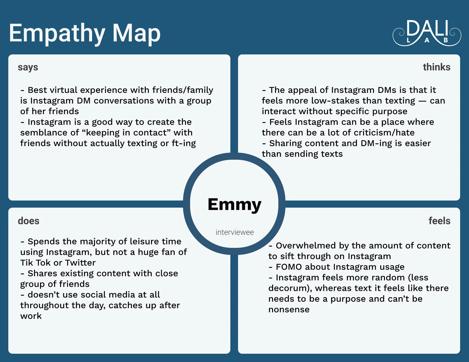
Attached below are examples of our empathy maps, user personas, and journey map that helped us to further identify the pain points of our target users.
Persona 1 - “Tech-Savvy Millennial”
Persona 2 - “Seasoned Tik Tok-er”
Now, what..?
After identifying the positive and negative experiences that users go through while scrolling on social media, we finally identified the core problem and fleshed out our Point of View statement:
Tech-Savvy gen-z or millennial who grew up on social media needs to find a way to engage with friends and family within the realm of social media in order to use the platform in a more mindful/ healthy way.
Our POV statement helped us to brainstorm some How Might We questions which later guided us to find solutions that fulfill our users’ needs. Our HMW questions covered a wide variety of solutions such as educating the users’ on using social media in a healthier way and limiting social media usage by creating a more engaging alternative. A dot-voting with the other team members helped us to settle on our core HMW question:
How might we provide a more engaging, real-time alternative to social media infinite scroll?
What did our HMW question really mean to us?
First, we wanted to make real-time interaction our main functionality. As mentioned before, we were informed that people are willing to engage in more activities on social media if they're interacting with close friends or if the content is interesting enough. Thus, we wanted to guide all our design decisions towards creating a sense of a shared experience and a close-knit community.
Second, we also wanted to take advantage of the users’ habit of scrolling endlessly on social media platforms like TikTok and Instagram. We knew that users will be tempted to scroll down for more content, but we also wanted to make the experience more meaningful and engaging.
Our HMW question also encouraged us to dig deeper into the interaction design of popular social media platforms since we wanted to build an “alternate” to those social media experiences.
Core design decisions
We drew inspiration from popular social media platforms like Instagram and TikTok to make the user flow simple and intuitive by flattening the learning curve for PrizeRing.
We also decided to have a single accent color and use whites and grays to not overwhelm the users considering the flashy content on the app.
Chose a bright orange as our main color due to its uniqueness from other gameshow or social media apps.
Chose “Nunito” as our main font as it looks playful and distinct from similar apps. Also, the font offers a variety of options for different text formats.
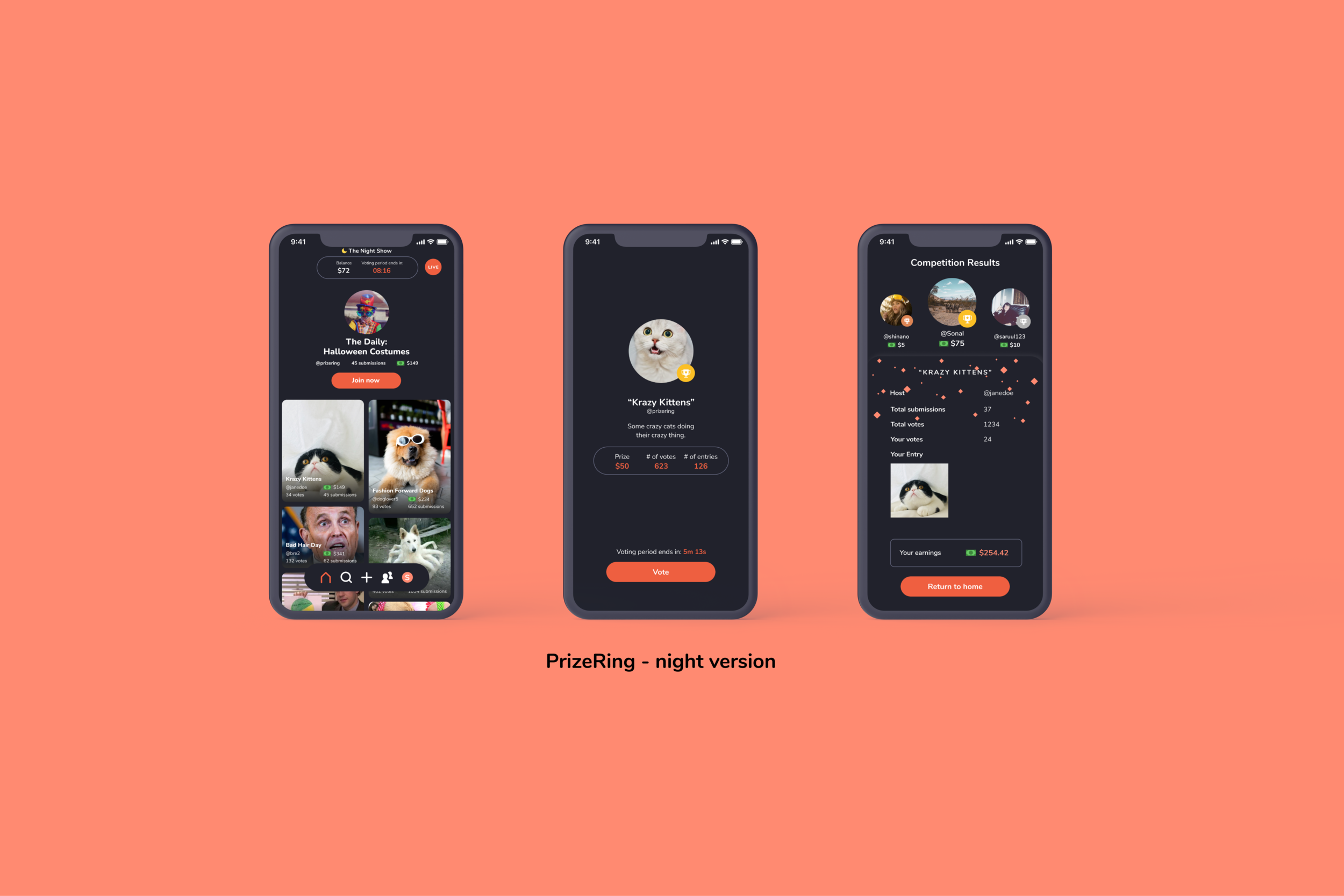
As PrizeRing has two main voting sessions during the day and night, we also designed a dark mode of the app. During our initial market research, we realized that users particularly enjoy the darker version of apps due to its simple and clean aesthetics.
Core features (functionality + design)
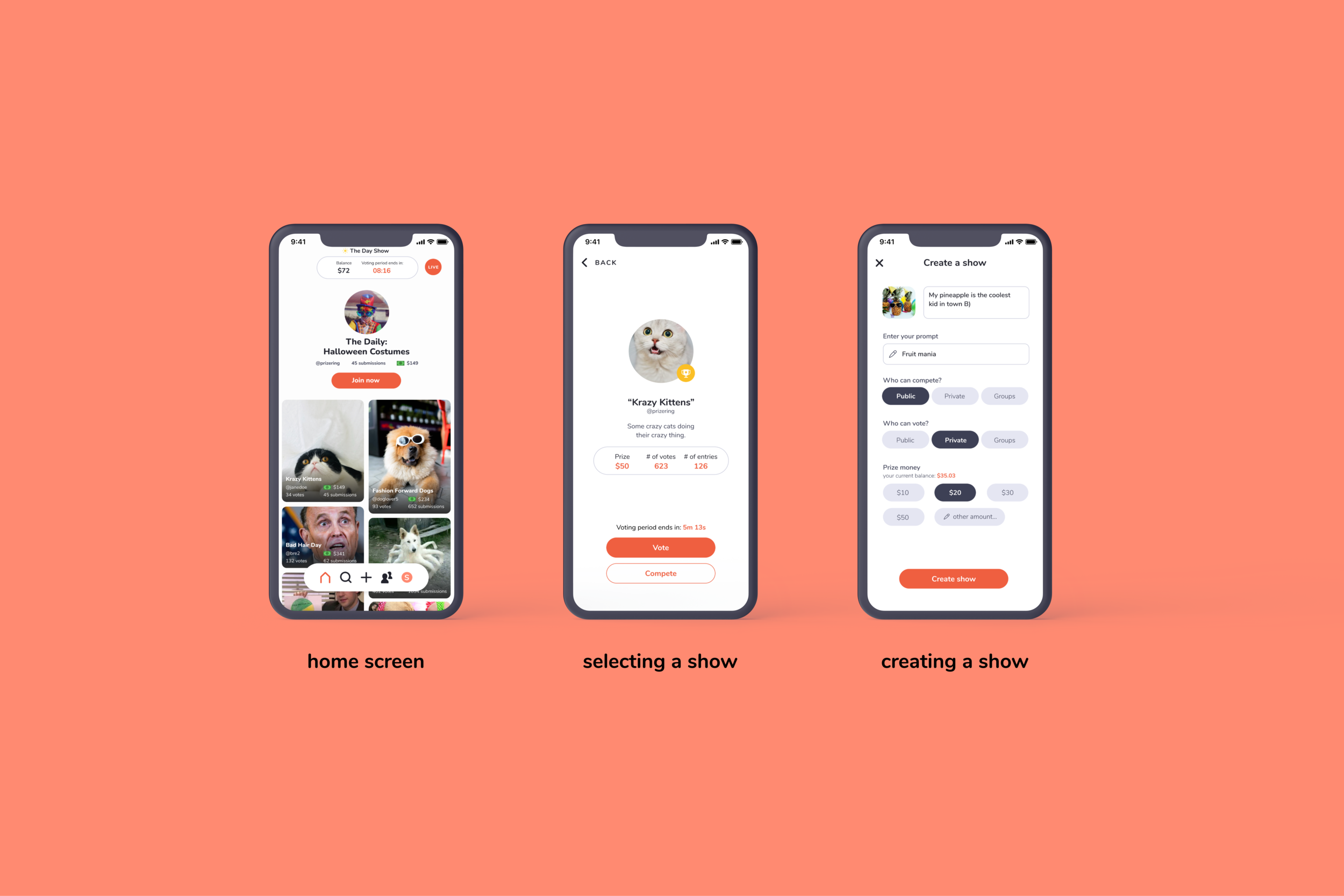
Home screen - Features daily sponsored game shows at the top and is followed by all the other live or scheduled game shows that the user can participate in. Users can also see their existing balance of funds and when the next voting period starts. The home screen aims to give a customized user experience by recommending user-catered game shows.
Select and/or Create a Game Show - Users can select a game show by either selecting the tile from the home screen or searching it. Users can also create their own game show by tapping on the “+” button at the center of the navigation bar.

3. Compete and Vote in a Game Show - Once the user chooses a game show, they can either vote on the photo & video content of others or participate by submitting their own content if the show hasn’t started yet.
4. Finish a Show and View the Results - Once voting for a show is complete, the competition results appear along with the leaderboard. The users are encouraged to join other ongoing game shows by returning to the home screen.

5. Build a Community - Encourages users to create private game shows with their friend groups and promotes the social experience of the app. The leaderboard also helps users to keep track of their performance and highlights their real-time connection with users all around the world.
6. View your user profile - Users can view their profile by selecting the profile icon in the navigation bar. The profile includes a brief description of the user and also a gallery of all the content that the user uploaded or saved in their profile.

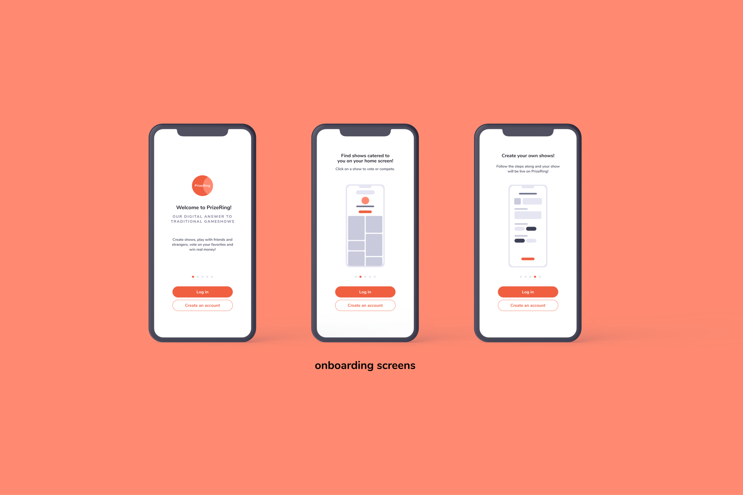
7. Onboarding - Asks users to either sign up or log in to their existing accounts. If the user is new to the app, the user will be presented with a thorough overview of the core functionalities of the app.


What did we do with our prototype?
We conducted 10+ user testing sessions and iterated our hi-fi grayscales. The usability test later in the term helped to refine our prototype and further simplify the interaction. Our design team also went through two design critique sessions with other designers and mentors at the DALI Lab, which also helped us to refine the prototype.
Initial Low-Fi Grayscales

Hi-Fi Grayscales

FINAL RESULT
You can check out the beta version of the app here: https://testflight.apple.com/join/7wreS4T6


